History of Ottoman Typography
History of Ottoman Typography
History of Ottoman Typography
History of Ottoman Typography
As a practitioner and educator of typography, I have a keen interest in the historical and theoretical frameworks that form the typographic design field. I am a native user, designer, and educator of the Latin script. However, I have recently turned my attention to the Arabic script and the history of Ottoman typography.
As a practitioner and educator of typography, I have a keen interest in the historical and theoretical frameworks that form the typographic design field. I am a native user, designer, and educator of the Latin script. However, I have recently turned my attention to the Arabic script and the history of Ottoman typography.
As a practitioner and educator of typography, I have a keen interest in the historical and theoretical frameworks that form the typographic design field. I am a native user, designer, and educator of the Latin script. However, I have recently turned my attention to the Arabic script and the history of Ottoman typography.
As a practitioner and educator of typography, I have a keen interest in the historical and theoretical frameworks that form the typographic design field. I am a native user, designer, and educator of the Latin script. However, I have recently turned my attention to the Arabic script and the history of Ottoman typography.
Background Overview
Background Overview
Background Overview
Background Overview
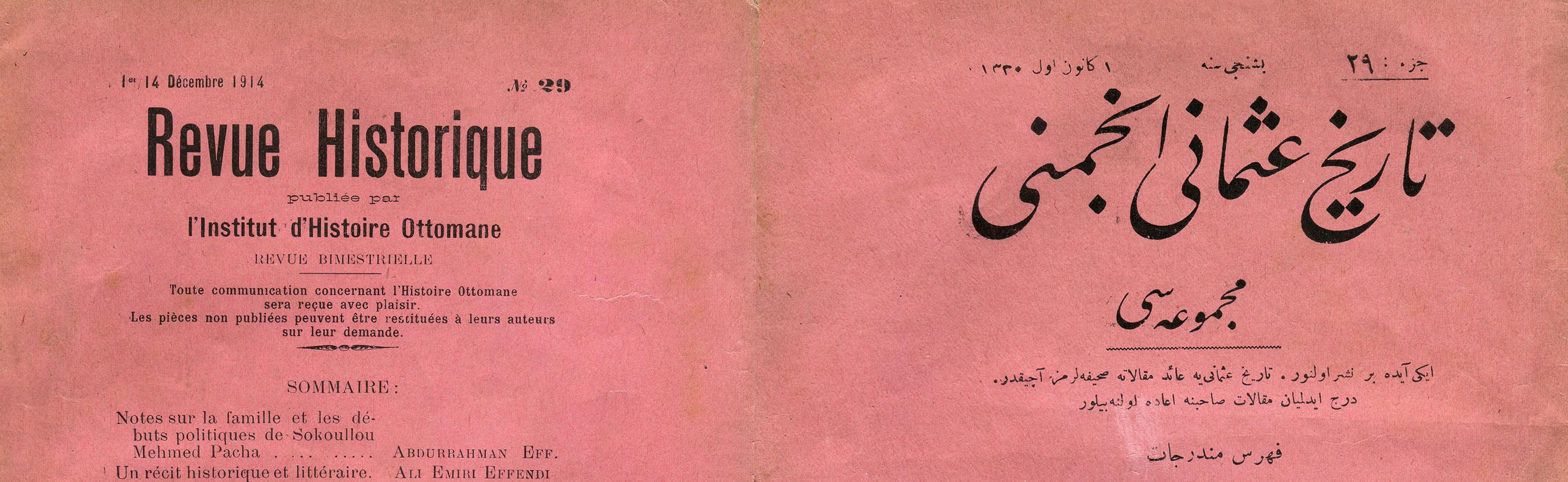
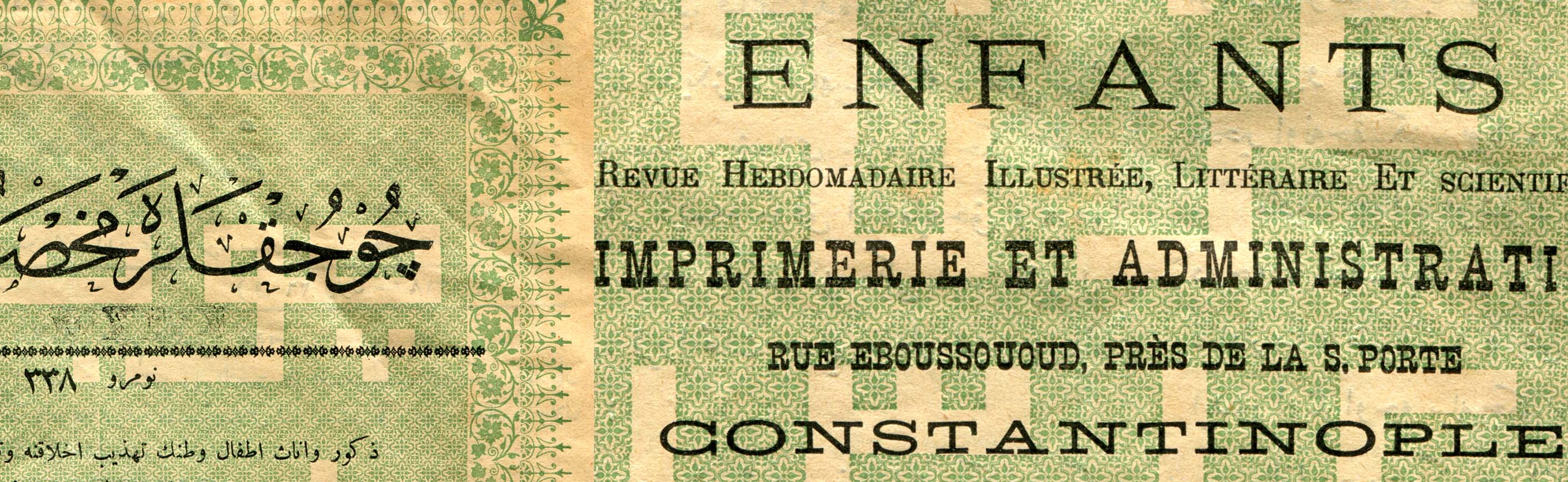
Turkish, which was represented with the Arabic script for over eight centuries, underwent a significant reform in 1928, when the newly-founded Turkish republic implemented a nationwide switch to the Latin alphabet. When I began my attempts to trace Turkish typographic activities following the script reform, I was faced with a barren field in terms of typeface production. After the script reform, the typographic visual references of Turkish graphic craftsmen invariably looked to the traditions of European calligraphy, lettering, and typography—but by no means was this the public’s first encounter with Latin letters. Since the mid-19th century, Istanbulites were well accustomed to seeing street signs and advertisements in Latin, Greek, and Armenian letters alongside those written in the Arabic script. Most signs in ferry and tramway stations displayed text in Turkish (using the Arabic script) and French. As the lingua franca among intellectual circles in Istanbul, French provided a visual environment for the Latin letters to exist and, at the turn of the century, several publications were set in both Turkish and French.
Turkish, which was represented with the Arabic script for over eight centuries, underwent a significant reform in 1928, when the newly-founded Turkish republic implemented a nationwide switch to the Latin alphabet. When I began my attempts to trace Turkish typographic activities following the script reform, I was faced with a barren field in terms of typeface production. After the script reform, the typographic visual references of Turkish graphic craftsmen invariably looked to the traditions of European calligraphy, lettering, and typography—but by no means was this the public’s first encounter with Latin letters. Since the mid-19th century, Istanbulites were well accustomed to seeing street signs and advertisements in Latin, Greek, and Armenian letters alongside those written in the Arabic script. Most signs in ferry and tramway stations displayed text in Turkish (using the Arabic script) and French. As the lingua franca among intellectual circles in Istanbul, French provided a visual environment for the Latin letters to exist and, at the turn of the century, several publications were set in both Turkish and French.
Turkish, which was represented with the Arabic script for over eight centuries, underwent a significant reform in 1928, when the newly-founded Turkish republic implemented a nationwide switch to the Latin alphabet. When I began my attempts to trace Turkish typographic activities following the script reform, I was faced with a barren field in terms of typeface production. After the script reform, the typographic visual references of Turkish graphic craftsmen invariably looked to the traditions of European calligraphy, lettering, and typography—but by no means was this the public’s first encounter with Latin letters. Since the mid-19th century, Istanbulites were well accustomed to seeing street signs and advertisements in Latin, Greek, and Armenian letters alongside those written in the Arabic script. Most signs in ferry and tramway stations displayed text in Turkish (using the Arabic script) and French. As the lingua franca among intellectual circles in Istanbul, French provided a visual environment for the Latin letters to exist and, at the turn of the century, several publications were set in both Turkish and French.
Turkish, which was represented with the Arabic script for over eight centuries, underwent a significant reform in 1928, when the newly-founded Turkish republic implemented a nationwide switch to the Latin alphabet. When I began my attempts to trace Turkish typographic activities following the script reform, I was faced with a barren field in terms of typeface production. After the script reform, the typographic visual references of Turkish graphic craftsmen invariably looked to the traditions of European calligraphy, lettering, and typography—but by no means was this the public’s first encounter with Latin letters. Since the mid-19th century, Istanbulites were well accustomed to seeing street signs and advertisements in Latin, Greek, and Armenian letters alongside those written in the Arabic script. Most signs in ferry and tramway stations displayed text in Turkish (using the Arabic script) and French. As the lingua franca among intellectual circles in Istanbul, French provided a visual environment for the Latin letters to exist and, at the turn of the century, several publications were set in both Turkish and French.
Turkish, which was represented with the Arabic script for over eight centuries, underwent a significant reform in 1928, when the newly-founded Turkish republic implemented a nationwide switch to the Latin alphabet. When I began my attempts to trace Turkish typographic activities following the script reform, I was faced with a barren field in terms of typeface production. After the script reform, the typographic visual references of Turkish graphic craftsmen invariably looked to the traditions of European calligraphy, lettering, and typography—but by no means was this the public’s first encounter with Latin letters. Since the mid-19th century, Istanbulites were well accustomed to seeing street signs and advertisements in Latin, Greek, and Armenian letters alongside those written in the Arabic script. Most signs in ferry and tramway stations displayed text in Turkish (using the Arabic script) and French. As the lingua franca among intellectual circles in Istanbul, French provided a visual environment for the Latin letters to exist and, at the turn of the century, several publications were set in both Turkish and French.
Turkish Script Reform:
Before & After
Turkish Script Reform:
Before & After
Turkish Script Reform:
Before & After
Turkish Script Reform
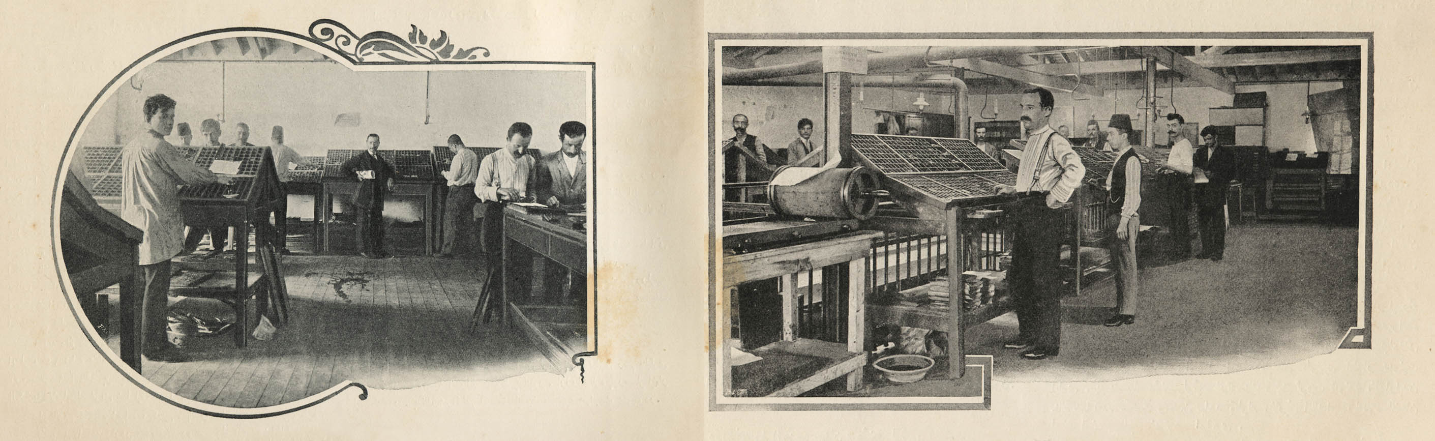
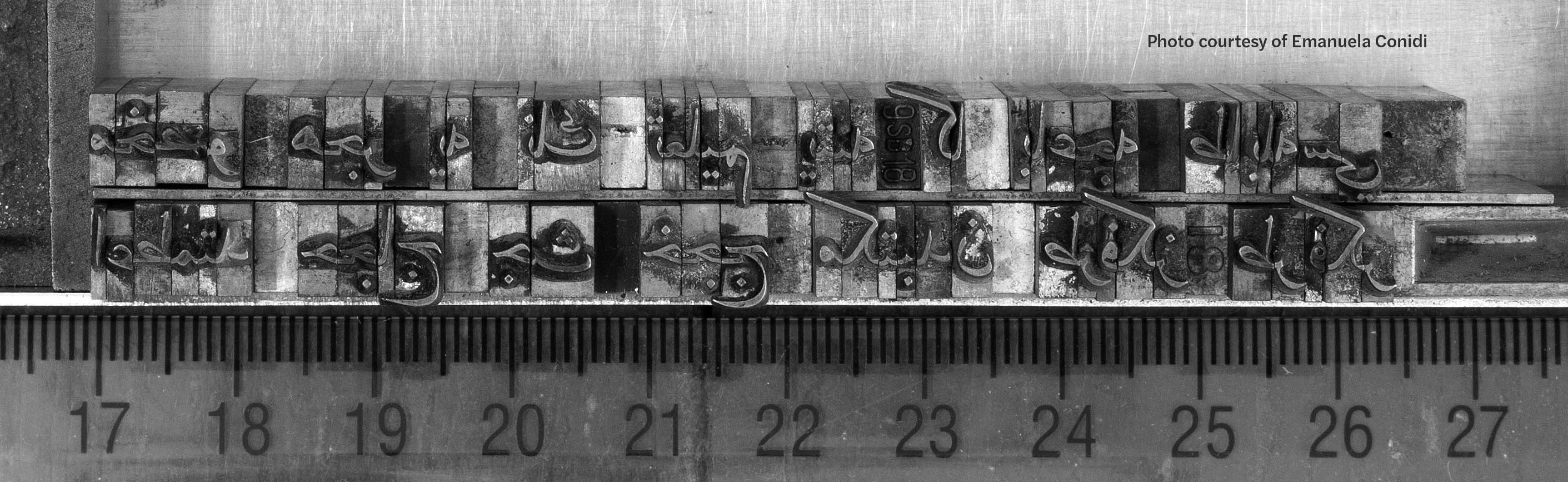
Before the script reform, Latin fonts to be set at a printer’s shop were imported from French and German type foundries. The importation of fonts continued after the reform, however, distancing—if not entirely excluding—Turkish craftsmen from the production of Latin letters. There were a number of type foundries selling Latin fonts in Istanbul at that time, but they were essentially re-casting them on original European matrices. In other words, we have yet to identify an “original” font design activity in Turkey with Latin letters during the early 20th century. The most prominent visual activity involving Latin letters during that time was the creation of custom hand lettering for posters and book covers. However, since these letters were not turned into a font system, they are not technically considered a “typographic” activity.
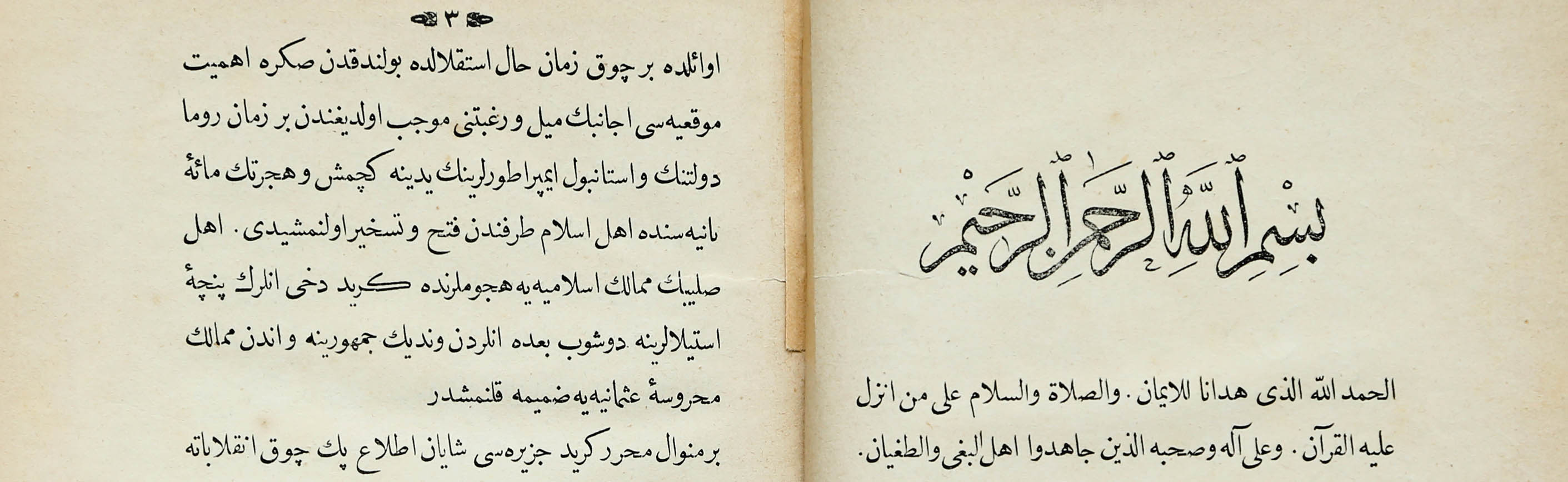
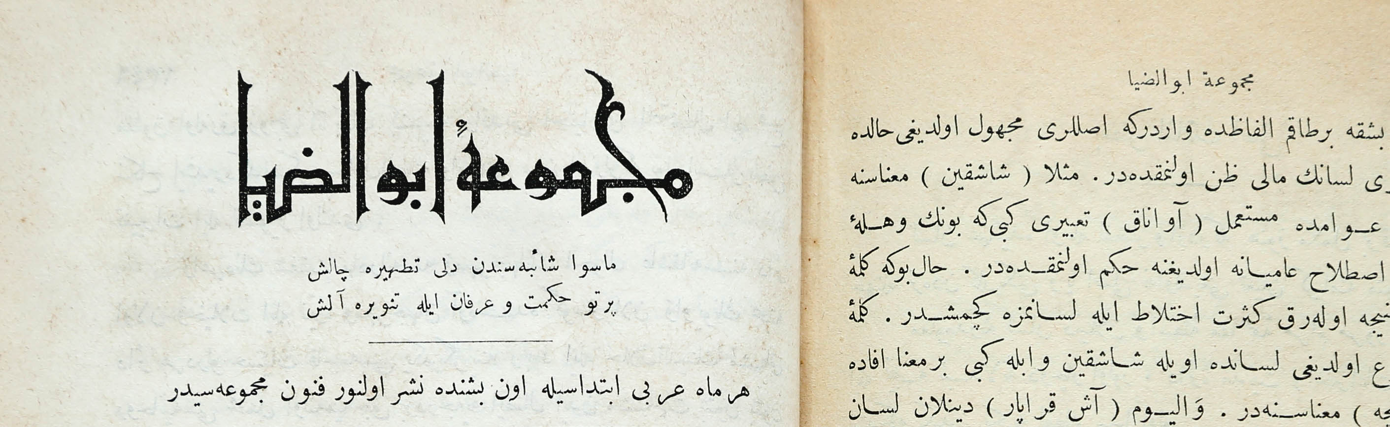
The lack of information about typographic practice in Turkey before the script reform roused a deep curiosity within me that led me to my current research. I began delving into this field by first learning Ottoman, which is essentially Turkish written with the Arabic script with the addition of a host of loan words from Arabic and Persian.
Before the script reform, Latin fonts to be set at a printer’s shop were imported from French and German type foundries. The importation of fonts continued after the reform, however, distancing—if not entirely excluding—Turkish craftsmen from the production of Latin letters. There were a number of type foundries selling Latin fonts in Istanbul at that time, but they were essentially re-casting them on original European matrices. In other words, we have yet to identify an “original” font design activity in Turkey with Latin letters during the early 20th century. The most prominent visual activity involving Latin letters during that time was the creation of custom hand lettering for posters and book covers. However, since these letters were not turned into a font system, they are not technically considered a “typographic” activity.
The lack of information about typographic practice in Turkey before the script reform roused a deep curiosity within me that led me to my current research. I began delving into this field by first learning Ottoman, which is essentially Turkish written with the Arabic script with the addition of a host of loan words from Arabic and Persian.
Contact
onur@istype.com
Sabancı University
Faculty of Arts & Social Sciences
Tuzla, 34956 Istanbul
All Rights Reserved ©2024 Onur Yazıcıgil